This papper mainly includes the following contents
- Loading
- Menus
- Modals
- Navigation
- Popover
- Radio
- Range
- Searchbar
Loading
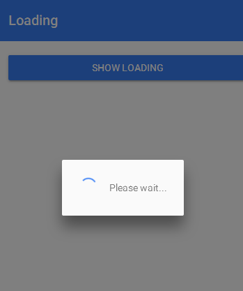
The Loading component is an overlay that prevents user interaction while indicating activity. By default, it shows a spinner based on the mode. It can also be passed any HTML content to display with the spinner. You can hide or change the spinner to any of our predefined spinners. The loading indicator is styled to display on top of other content even during navigation.
Basic Usage
presentLoading() {
  let loading = Loading.create({
    content: "Please wait...",
    duration: 3000
  });
  this.nav.present(loading);
}
Menu
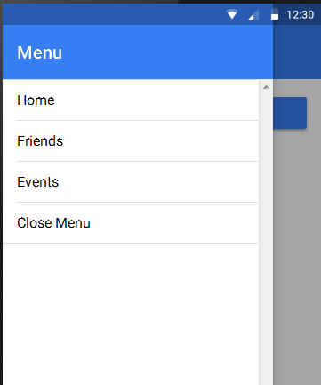
Menu is a side-menu navigation that can be dragged out or toggled to show. Menu supports two display styles currently: overlay, and reveal. Overlay is the tradtional Android drawer style, and Reveal is the traditional iOS style. By default, Menu will adjust to the correct style for the platform.
Along with Tabs, Menus are a common way to navigate through an app if you have several “root” or “top-level” pages. For the basics of navigating through an Ionic app, see the Navigation section.
For UX reasons, we first recommend using Tabs. However, for situations where using Tabs might not be desirable, for example if you have a large number of root pages (making a TabBar impractical), a menu might be a better solution.
Menus also allow you to return to root pages at any point. This can be helpful if you have particularly deep navigation by allowing you to return to the top level of your app quickly.
However, because Menus are not always and immediately visible on screen, they require more work for the user than Tabs. Make sure to weigh your priorities when designing the navigational structure of your app.
To use a Menu add an
Basic Usage
import {Component, ViewChild} from '@angular/core';
import {ionicBootstrap, Platform, MenuController, Nav} from 'ionic-angular';
import {StatusBar} from 'ionic-native';
import {HelloIonicPage} from './pages/hello-ionic/hello-ionic';
import {ListPage} from './pages/list/list';
import {Test} from './pages/test/test';


@Component({
  templateUrl: 'build/app.html'
})
class MyApp {
  @ViewChild(Nav) nav: Nav;

  // make HelloIonicPage the root (or first) page
  rootPage: any = HelloIonicPage;
  pages: Array<{title: string, component: any}>;

  constructor(
    private platform: Platform,
    private menu: MenuController
  ) {
    this.initializeApp();

    // set our app's pages
    this.pages = [
      { title: 'Hello Ionic', component: HelloIonicPage },
      { title: 'My First List', component: ListPage },
      { title: 'test',component:Test}
    ];
  }

  initializeApp() {
    this.platform.ready().then(() => {
      // Okay, so the platform is ready and our plugins are available.
      // Here you can do any higher level native things you might need.
      StatusBar.styleDefault();
    });
  }

  openPage(page) {
    // close the menu when clicking a link from the menu
    this.menu.close();
    // navigate to the new page if it is not the current page
    this.nav.setRoot(page.component);
  }
}

ionicBootstrap(MyApp);
app.html
<ion-menu [content]="content">

  <ion-toolbar>
    <ion-title>Pages</ion-title>
  </ion-toolbar>

  <ion-content>
    <ion-list>
      <button ion-item *ngFor="let p of pages" (click)="openPage(p)">

      </button>
    </ion-list>
  </ion-content>

</ion-menu>

<ion-nav [root]="rootPage" #content swipe-back-enabled="false"></ion-nav>
Modals
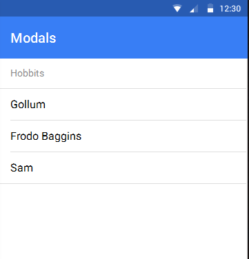
Modals slide in off screen to display a temporary UI, often used for login or signup pages, message composition, and option selection.
Basic Usage
<ion-header>
  <ion-navbar>
    <ion-title>Modals</ion-title>
  </ion-navbar>
</ion-header>

<ion-content>

  <ion-list>
    <ion-list-header>
      Hobbits
    </ion-list-header>
    <a ion-item (click)="openModal({charNum: 0})">
      Gollum
    </a>
    <a ion-item (click)="openModal({charNum: 1})">
      Frodo Baggins
    </a>
    <a ion-item (click)="openModal({charNum: 2})">
      Sam
    </a>
  </ion-list>

</ion-content>
modals.ts
import {Component} from '@angular/core';
import {Modal, Platform, NavController, NavParams, ViewController} from 'ionic-angular';


@Component({
 templateUrl: 'build/pages/four/four.html'
})
export class Four {
 constructor(public nav: NavController) { }

  openModal(characterNum) {
    let modal = Modal.create(ModalsContentPage, characterNum);
    this.nav.present(modal);
  }
}

@Component({
  templateUrl: 'build/pages/four/modal-content.html'
})
class ModalsContentPage {
  character;

  constructor(
      public platform: Platform,
      public params: NavParams,
      public viewCtrl: ViewController
  ) {
    var characters = [
      {
        name: 'Gollum',
        quote: 'Sneaky little hobbitses!',
        image: 'img/avatar-gollum.jpg',
        items: [
          { title: 'Race', note: 'Hobbit' },
          { title: 'Culture', note: 'River Folk' },
          { title: 'Alter Ego', note: 'Smeagol' }
        ]
      },
      {
        name: 'Frodo',
        quote: 'Go back, Sam! I\'m going to Mordor alone!',
        image: 'img/avatar-frodo.jpg',
        items: [
          { title: 'Race', note: 'Hobbit' },
          { title: 'Culture', note: 'Shire Folk' },
          { title: 'Weapon', note: 'Sting' }
        ]
      },
      {
        name: 'Samwise Gamgee',
        quote: 'What we need is a few good taters.',
        image: 'img/avatar-samwise.jpg',
        items: [
          { title: 'Race', note: 'Hobbit' },
          { title: 'Culture', note: 'Shire Folk' },
          { title: 'Nickname', note: 'Sam' }
        ]
      }
    ];
    this.character = characters[this.params.get('charNum')];
  }

  dismiss() {
    this.viewCtrl.dismiss();
  }
}
Navigation
Navigation is how users move between different pages in your app. Ionic’s navigation follows standard native animation concepts, like those in iOS.
Like native apps, URLs are not required for navigation. Instead, pages are pushed and popped on and off a navigation controller’s page stack. URLs can be used to link back to unique, important parts of your app (“deeplinking”) but don’t define navigation as your app runs.
There are several ways to navigate throughout an Ionic app:
Basic Navigation
The simplest way to navigate throughout your app is to create and initialize a new navigation controller, using
  import {StartPage} from 'start'

  @Component({
    template: '<ion-nav [root]="rootPage"></ion-nav>'
  })
  class MyApp {
    // First page to push onto the stack
    rootPage = StartPage;
    constructor(){}
  }

  ionicBootstrap(MyApp)
You can access the navigation controller you create by injecting it into any of your Pages:
@Component({
  template: `
  <ion-header>
    <ion-navbar>
      <ion-title>Login</ion-title>
    </ion-navbar>
  </ion-header>

    <ion-content>Hello World</ion-content>`
})
export class StartPage {
  constructor(private nav: NavController){}
}
To navigate from one page to another simply push or pop a new page onto the stack:
@Component({
  template: `
  <ion-header>
    <ion-navbar>
      <ion-title>Login</ion-title>
    </ion-navbar>
  </ion-header>

    <ion-content>
      <button (click)="goToOtherPage()">
        Go to OtherPage
      </button>
    </ion-content>`
})
export class StartPage {
  constructor(private nav: NavController) {}

  goToOtherPage(){
    //push another page onto the history stack
    //causing the nav controller to animate the new page in
    this.nav.push(OtherPage);
  }
}

@Component({
  template: `
  <ion-header>
    <ion-navbar>
      <ion-title>Other Page</ion-title>
    </ion-navbar>
  </ion-header>

    <ion-content>I'm the other page!</ion-content>`
})
class OtherPage {}
If your page has an
Alternatively, if you want to go back, but don’t have a NavBar, you can pop the current page off the stack:
@Component({
  template: `
    <ion-content>
      <button (click)="goBack()">
        There's no place like home
      </button>
    </ion-content>`
})
class OtherPage {
  constructor(private nav: NavController) {}

  goBack() {
    this.nav.pop();
  }
}
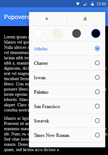
Popover
The Popover is a view that floats above an app’s content. Popovers provide an easy way to present or gather information from the user and are commonly used in the following situations:
- Show more info about the current view
- Select a commonly used tool or configuration
- Present a list of actions to perform inside one of your views
Basic Usage
@Component({
  template: `This is a popover`
})

export class MyPopover{}

@Component({
  templateUrl: 'build/pages/home/home.html'
})

export class HomePage{
  constructor(
    private nav: NavController
  ){}

  showPopover(){
    let popover = Popover.create(MyPopover)
    this.nav.present(popover, {
      ev: ev
    })
  }
}
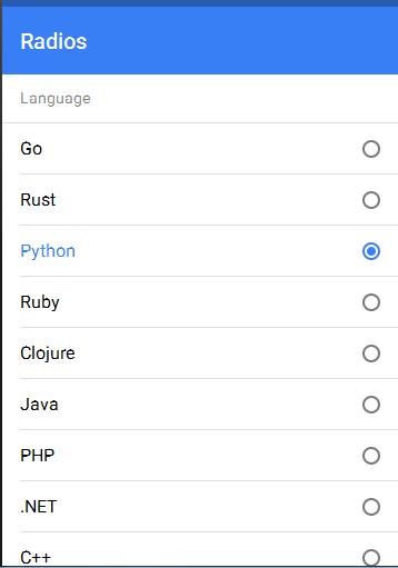
Radio
Like the checkbox, a radio is an input component that holds a boolean value. Under the hood, radios are no different than HTML radio inputs. However, like other Ionic components, radios are styled differently on each platform. Unlike checkboxes, radio components form a group, where only one radio can be selected at a time. Use the checked attribute to set the default value, and the disabled attribute to disable the user from changing to that value.
Basic Usage
<ion-list radio-group>
  <ion-list-header>
    Language
  </ion-list-header>

  <ion-item>
    <ion-label>Go</ion-label>
    <ion-radio checked="true" value="go"></ion-radio>
  </ion-item>

  <ion-item>
    <ion-label>Rust</ion-label>
    <ion-radio value="rust"></ion-radio>
  </ion-item>

  <ion-item>
    <ion-label>Python</ion-label>
    <ion-radio value="python" disabled="true"></ion-radio>
  </ion-item>
</ion-list>
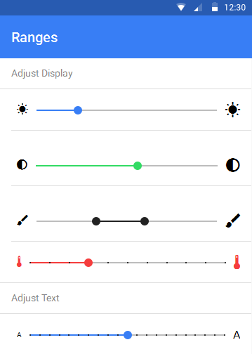
Range
A Range is a control that lets users select from a range of values by moving a slider knob along the slider bar or track.
Basic Usage
In the below example, data bindings are set up using ngModel.
<ion-item>
  <ion-range [(ngModel)]="brightness">
    <ion-icon range-left small name="sunny"></ion-icon>
    <ion-icon range-right name="sunny"></ion-icon>
  </ion-range>
</ion-item>
A tooltip displaying the current value while moving the knob can be added with the property pin:
<ion-item>
  <ion-range min="-200" max="200" pin="true" [(ngModel)]="contrast" secondary>
    <ion-icon range-left small name="contrast"></ion-icon>
    <ion-icon range-right name="contrast"></ion-icon>
  </ion-range>
</ion-item>
To increment the value based on a certain number, add the step property:
<ion-item>
  <ion-range min="1000" max="2000" step="100" snaps="true" [(ngModel)]="warmth" danger>
    <ion-icon range-left small danger name="thermometer"></ion-icon>
    <ion-icon range-right danger name="thermometer"></ion-icon>
  </ion-range>
</ion-item>
To add two knobs to a range, add the dualKnobs property:
<ion-range dualKnobs="true" pin="true" [(ngModel)]="structure" dark>
  <ion-icon range-left small name="brush"></ion-icon>
  <ion-icon range-right name="brush"></ion-icon>
</ion-range>
Searchbar
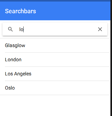
A Searchbar binds to a model, and emits an input event when the model is changed.
Basic Usage
<ion-searchbar (ionInput)="getItems($event)"></ion-searchbar>
<ion-list>
  <ion-item *ngFor="let item of items">

  </ion-item>
</ion-list>
Note that in this example, the getItems() function is called when the input changes, which updates the cities that are displayed. Although this example filters the list based on the search input, Searchbar can be used in many different scenarios:
@Component({
  templateUrl: 'search/template.html',
})
class SearchPage {
  constructor() {
    this.searchQuery = '';
    this.initializeItems();
  }

  initializeItems() {
    this.items = [
      'Amsterdam',
      'Bogota',
      ...
    ];
  }

  getItems(ev) {
    // Reset items back to all of the items
    this.initializeItems();

    // set val to the value of the searchbar
    let val = ev.target.value;

   // if the value is an empty string don't filter the items
      if (val && val.trim() != '') {
        this.items = this.items.filter((item) => {
          return (item.toLowerCase().indexOf(val.toLowerCase()) > -1);
        })
      }
  }
}
The Searchbar takes a number of configuration options on the