This papper mainly includes the following contents
- Checkbox
- DateTime
- Gesture
- Grid
- Icon
- Inputs
- Lists
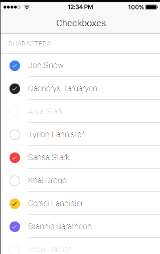
Checkbox
A checkbox is an input component that holds a boolean value. Checkboxes are no different than HTML checkbox inputs. However, like other Ionic components, checkboxes are styled differently on each platform. Use the checked attribute to set the default value, and the disabled attribute to disable the user from changing the value.
Basic Usage
<ion-item>
  <ion-label>Daenerys Targaryen</ion-label>
  <ion-checkbox dark checked="true"></ion-checkbox>
</ion-item>

<ion-item>
  <ion-label>Arya Stark</ion-label>
  <ion-checkbox disabled="true"></ion-checkbox>
</ion-item>
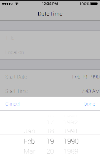
DateTime
The DateTime component is used to present an interface which makes it easy for users to select dates and times. The DateTime component is similar to the native element, however, Ionic’s DateTime component makes it easy to display the date and time in a preferred format, and manage the datetime values.
Basic Usage
<ion-item>
  <ion-label>Start Time</ion-label>
  <ion-datetime displayFormat="h:mm A" pickerFormat="h mm A" [(ngModel)]="event.timeStarts"></ion-datetime>
</ion-item>
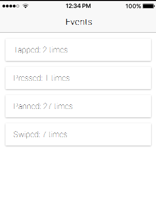
Gesture
You can target specific gestures to trigger specific functionality. Built on top of Hammer.js, you can bind to tap, press, pan, swipe, rotate, and pinch.
<ion-header>
  <ion-navbar>
    <ion-title>Events</ion-title>
  </ion-navbar>
</ion-header>

<ion-content>

  <ion-card (tap)="tapEvent($event)">
    <ion-item>
      Tapped:  times
    </ion-item>
  </ion-card>

  <ion-card (press)="pressEvent($event)">
    <ion-item>
      Pressed:  times
    </ion-item>
  </ion-card>

  <ion-card (pan)="panEvent($event)">
    <ion-item>
      Panned:  times
    </ion-item>
  </ion-card>

  <ion-card (swipe)="swipeEvent($event)">
    <ion-item>
      Swiped:  times
    </ion-item>
  </ion-card>

</ion-content>
import {Component} from '@angular/core';

@Component({
  templateUrl: './build/pages/gestures/basic/template.html'
})
export class BasicPage {

  public press: number = 0;
  public pan: number = 0;
  public swipe: number = 0;
  public tap: number = 0;
  constructor() {

  }
  pressEvent(e) {
    this.press++
  }
  panEvent(e) {
    this.pan++
  }
  swipeEvent(e) {
    this.swipe++
  }
  tapEvent(e) {
    this.tap++
  }

}
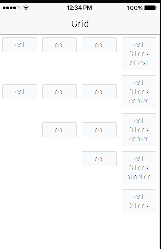
Grid
Ionic’s grid system is based on flexbox, a CSS feature supported by all devices that Ionic supports. The grid is composed of three units — grid, rows and columns. Columns will expand to fill their row, and will resize to fit additional columns.
Rows have no padding or margin applied to them. If that is needed, ion-grid can be added to provide additional padding.
In order to set width use width attribute on ion-col tag.
<ion-grid>
  <ion-row>
    <ion-col width-10>This column will take 10% of space</ion-col>
  </ion-row>
</ion-grid>
Use the offset attribute on a column to set its percent offset from the left (eg: offset-25). To change how columns in a row align vertically, add the center or baseline attribute to an
Use the wrap attribute on an
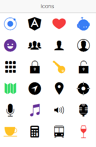
Icon
Ionic comes with the same 700+ Ionicons icons we’ve all come to know and love.
Basic Usage
To use an icon, just add the Icon’s CSS class to your element:
<ion-icon name="heart"></ion-icon>
Active / Inactive Icons
All icons have both active and inactive states. Active icons are typically full and thick, where as inactive icons are outlined and thin. Set the isActive attribute to true or false to change the state of the icon. Icons will default to active if a value is not specified.
<ion-icon name="heart"></ion-icon>                    <!-- active -->
<ion-icon name="heart" isActive="false"></ion-icon>  <!-- inactive -->
Platform Specific Icons:
Many icons have both Material Design and iOS versions. Ionic will automatically use the correct version based on the platform.
However, if you want more control, you can explicitly set the icon to use for each platform. Use the md (material design) and ios attributes to specify a platform specific icon:
<ion-icon ios="logo-apple" md="logo-android"></ion-icon>
Variable Icons:
To set an icon using a variable:
<ion-icon [name]="myIcon"></ion-icon>

export class MyFirstPage {
  // use the home icon
  myIcon: string = "home";
}
Inputs
Inputs are essential for collecting and handling user input in a secure way. They should follow styling and interaction guidelines for each platform, so that they are intuitive for users to interact with. Ionic uses Angular 2’s form library, which can be thought of as two dependent pieces, Controls, and Control Groups.
Each input field in a form has a Control, a function that binds to the value in the field, and performs validation. A Control Group is a collection of Controls. Control Groups handle form submission, and provide a high level API that can be used to determine whether the entire form is valid.
A number of attributes that can be used to style forms and their various input fields are listed below. For more info on form logic, check out the Inputs API docs.
- Fixed Inline Labels
Use fixed to place a label to the left of the input element. When the user enters text, the label does not hide. The user’s input will align on the same position, regardless of the length of the label. Note that there’s nothing stopping you from also using a placeholder label too. - Floating Labels
Floating labels are just like Stacked Labels, except that their labels animate, or “float” up when text is entered in the input. Eachshould have the floating attribute assigned. - Inline Labels
If a label attribute is not provided, ancomponent will default to using an inline label. When the user enters text, the label does not hide. Note that there’s nothing stopping you from also using a placeholder as well. - Inset Labels
By default each input item will fill 100% of the width of its parent element (the list). However, you can inset the list by adding the inset attribute. - Placeholder Labels
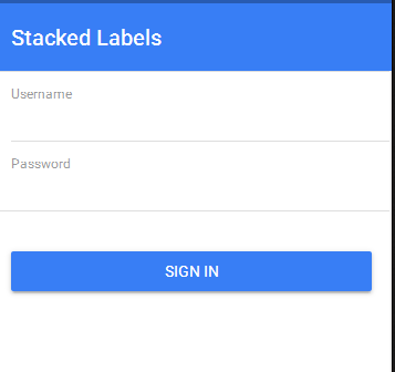
Add the placeholder attribute to an element to simulate the input’s label. When the user begins to enter text into the input, the placeholder label will be hidden. - Stacked Labels
Basic Usages
<ion-list>

  <ion-item>
    <ion-label stacked>Username</ion-label>
    <ion-input type="text"></ion-input>
  </ion-item>

  <ion-item>
    <ion-label stacked>Password</ion-label>
    <ion-input type="password"></ion-input>
  </ion-item>

</ion-list>
Lists
Lists are used to display rows of information, such as a contact list, playlist, or menu. Or maybe something crazy we don’t even know exists yet!
Basic Usage (Default)
By default, all lists will be styled with divider lines:
<ion-list>
  <ion-item *ngFor="let item of items" (click)="itemSelected(item)">

  </ion-item>
</ion-list>
Basic Usage (No Lines)
Adding the no-lines attribute will hide the dividers between list items:
<ion-list no-lines>
  <ion-item *ngFor="let item of items" (click)="itemSelected(item)">

  </ion-item>
</ion-list>
Inset List
By default, lists have no outside margin, to add one, add the inset property to the list component.
<ion-list inset>
  <ion-item *ngFor="let item of items" (click)="itemSelected(item)">

  </ion-item>
</ion-list>
List Dividers
To divide groups of items, use
<ion-content>
    <ion-item-group>

      <ion-item-divider light>A</ion-item-divider>
      <ion-item>Angola</ion-item>
      <ion-item>Argentina</ion-item>

    </ion-item-group>
</ion-content>
List Headers
Each list can include a header at the top of the list,looks quite like list dividers:
<ion-list>
  <ion-list-header>
    Action
  </ion-list-header>
  <ion-item>Terminator II</ion-item>
  <ion-item>The Empire Strikes Back</ion-item>
  <ion-item>Blade Runner</ion-item>
</ion-list>
Icon List
Adding icons to list items is a great way to hint about the contents of each item. The position of the icon can be set using the item-left and item-right attributes:
<ion-list>
  <ion-item>
    <ion-icon name="leaf" item-left></ion-icon>
      Herbology
    <ion-icon name="rose" item-right></ion-icon>
  </ion-item>
</ion-list>
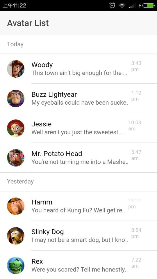
Avatar List
Item avatars showcase an image larger than an icon, but smaller than a thumbnail. To use an avatar, add an
<ion-list>
  <ion-item>
    <ion-avatar item-left>
      <img src="img/avatar-cher.png">
    </ion-avatar>
    <h2>Cher</h2>
    <p>Ugh. As if.</p>
  </ion-item>
</ion-list>
Multiline List
Multiline lists are identical to regular lists, except they can multiple lines of text. When multiple header or paragraph tags are added to an
<ion-list>
  <ion-item>
    <ion-avatar item-left>
      <img src="img/avatar-finn.png">
    </ion-avatar>
    <h2>Finn</h2>
    <h3>Don't Know What To Do!</h3>
    <p>I've had a pretty messed up day. If we just...</p>
  </ion-item>
</ion-list>
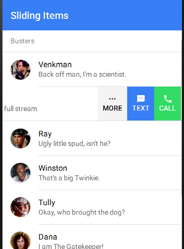
Sliding List
Sliding items can be swiped to the left to reveal a set of buttons. To use a sliding item, add a
<ion-list>
  <ion-item-sliding>
    <ion-item>
      <ion-avatar item-left>
        <img src="img/slimer.png">
      </ion-avatar>
      <h2>Slimer</h2>
    </ion-item>
    <ion-item-options>
      <button primary>
        <ion-icon name="text"></ion-icon>
        Text
      </button>
      <button secondary>
        <ion-icon name="call"></ion-icon>
        Call
      </button>
    </ion-item-options>
  </ion-item-sliding>
</ion-list>
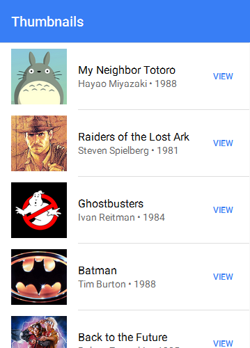
Thumbnail List
Item thumbnails showcase an image that takes up the entire height of an item. To use a thumbnail, add an
<ion-list>
  <ion-item>
    <ion-thumbnail item-left>
      <img src="img/thumbnail-totoro.png">
    </ion-thumbnail>
    <h2>My Neighbor Totoro</h2>
    <p>Hayao Miyazaki • 1988</p>
    <button clear item-right>View</button>
  </ion-item>
</ion-list>