本文主要包括以下内容
- WebView组件
- Modal组件
WebView组件
WebView组件最基本的使用方法,直接加载一个网页
'use strict';
import React, {
  AppRegistry,
  Component,
  StyleSheet,
  Text,
  View,
  WebView,
} from 'react-native';
var DEFAULT_URL = 'http://www.lcode.org';

var WebViewDemo = React.createClass({
  render: function() {
    return (
      <View style=>
        <Text style=>简单的网页显示</Text>
        <WebView style={styles.webview_style}
          url={DEFAULT_URL}
          startInLoadingState={true}
          domStorageEnabled={true}
          javaScriptEnabled={true}
          >
        </WebView>
      </View>
    );
  },
});
var styles = StyleSheet.create({
    webview_style:{
       backgroundColor:'#00ff00',
    }
});

AppRegistry.registerComponent('WebViewDemo', () => WebViewDemo);
effect

WebView加载本地的HTML静态字符串
'use strict';
import React, {
  AppRegistry,
  Component,
  StyleSheet,
  Text,
  View,
  WebView,
} from 'react-native';
var DEFAULT_URL = 'http://www.lcode.org';
const HTML = `
<!DOCTYPE html>\n
<html>
  <head>
    <title>HTML字符串</title>
    <meta http-equiv="content-type" content="text/html; charset=utf-8">
    <meta name="viewport" content="width=320, user-scalable=no">
    <style type="text/css">
      body {
        margin: 0;
        padding: 0;
        font: 62.5% arial, sans-serif;
        background: #ccc;
      }
      h1 {
        padding: 45px;
        margin: 0;
        text-align: center;
        color: #33f;
      }
    </style>
  </head>
  <body>
    <h1>加载静态的HTML文本信息</h1>
  </body>
</html>
`;
var WebViewDemo = React.createClass({
  render: function() {
    return (
      <View style=>
        <WebView style={styles.webview_style}
          html={HTML}
          startInLoadingState={true}
          domStorageEnabled={true}
          javaScriptEnabled={true}
          >
        </WebView>
      </View>
    );
  },
});
var styles = StyleSheet.create({
    webview_style:{
       backgroundColor:'#00ff00',
    }
});

AppRegistry.registerComponent('WebViewDemo', () => WebViewDemo);
effect

Modal组件
Modal视图在iOS原生开发中熟称:”模态视图”,Modal进行封装之后,可以弹出来覆盖包含React Native跟视图的原生界面(例如:UiViewControllView,Activity)。在使用React Native开发的混合应用中使用Modal组件,该可以让你使用RN开发的内功呈现在原生视图的上面。
如果你使用React Native开发的应用,从跟视图就开始开发起来了,那么你应该是Navigator导航器进行控制页面弹出,而不是使用Modal模态视图。通过顶层的Navigator,你可以使用configureScene属性进行控制如何在你开发的App中呈现一个Modal视图。
属性方法
1.animated bool 控制是否带有动画效果
2.onRequestClose Platform.OS===’android’? PropTypes.func.isRequired : PropTypes.func
3.onShow function方法
4.transparent bool 控制是否带有透明效果
5.visible bool 控制是否显示
实例
/**
* Sample React Native App
* https://github.com/facebook/react-native
* @flow
*/
import React, {
AppRegistry,
Component,
StyleSheet,
Text,
View,
TouchableHighlight,
Modal,
Switch,
} from 'react-native';
class Button extends React.Component {
constructor(props){
super(props);
this.state={
active: false,
};
this._onHighlight = this.onHighlight.bind(this);
this._onUnhighlight = this.onUnhighlight.bind(this);
}
onHighlight() {
this.setState({active: true,});
}
onUnhighlight() {
this.setState({active: false,});
}
render() {
var colorStyle = {
color: this.state.active ? '#fff' : '#000',
};
return (
<TouchableHighlight
onHideUnderlay={this._onUnhighlight}
onPress={this.props.onPress}
onShowUnderlay={this._onHighlight}
style={[styles.button, this.props.style]}
underlayColor="#a9d9d4">
<Text style={[styles.buttonText, colorStyle]}>{this.props.children}</Text>
</TouchableHighlight>
);
}
}
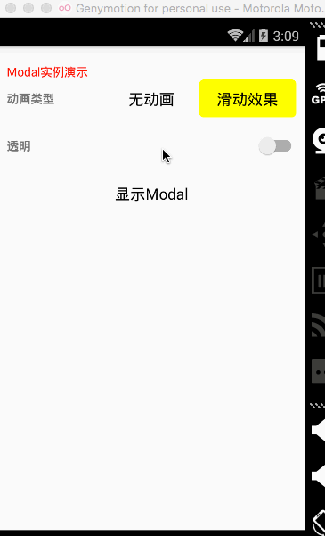
class ModalDemo extends Component {
constructor(props){
super(props);
this.state={
animationType: false,
modalVisible: false,
transparent: false,
};
this._toggleTransparent = this.toggleTransparent.bind(this);
}
_setModalVisible(visible) {
this.setState({modalVisible: visible});
}
_setAnimationType(type) {
this.setState({animationType: type});
}
toggleTransparent() {
this.setState({transparent: !this.state.transparent});
}
render() {
const modalBackgroundStyle = {
backgroundColor: this.state.transparent ? 'rgba(0, 0, 0, 0.5)' : '#f5fcff',
}
const innerContainerTransparentStyle = this.state.transparent
? {backgroundColor: 'red', padding: 20}
: null
return (
<View style=>
<Text style=>Modal实例演示</Text>
<Modal
animated={this.state.animationType}
transparent={this.state.transparent}
visible={this.state.modalVisible}
onRequestClose={() => {this._setModalVisible(false)}}
>
<View style={[styles.container, modalBackgroundStyle]}>
<View style={[styles.innerContainer, innerContainerTransparentStyle]}>
<Text>Modal视图被显示:{this.state.animationType === false ? '没有' : '有',this.state.animationType}动画效果.</Text>
<Button
onPress={this._setModalVisible.bind(this, false)}
style={styles.modalButton}>
关闭Modal
</Button>
</View>
</View>
</Modal>
<View style={styles.row}>
<Text style={styles.rowTitle}>动画类型</Text>
<Button onPress={this._setAnimationType.bind(this,false)} style={this.state.animationType === false ? {backgroundColor:'red'}: {}}>
无动画
</Button>
<Button onPress={this._setAnimationType.bind(this, true)} style={this.state.animationType === true ? {backgroundColor:'yellow'} : {}}>
滑动效果
</Button>
</View>
<View style={styles.row}>
<Text style={styles.rowTitle}>透明</Text>
<Switch value={this.state.transparent} onValueChange={this._toggleTransparent} />
</View>
<Button onPress={this._setModalVisible.bind(this, true)}>
显示Modal
</Button>
</View>
)}
}
const styles = StyleSheet.create({
container: {
flex: 1,
justifyContent: 'center',
padding: 20,
},
innerContainer: {
borderRadius: 10,
alignItems: 'center',
},
row: {
alignItems: 'center',
flex: 1,
flexDirection: 'row',
marginBottom: 20,
},
rowTitle: {
flex: 1,
fontWeight: 'bold',
},
button: {
borderRadius: 5,
flex: 1,
height: 44,
alignSelf: 'stretch',
justifyContent: 'center',
overflow: 'hidden',
},
buttonText: {
fontSize: 18,
margin: 5,
textAlign: 'center',
},
modalButton: {
marginTop: 10,
},
});
AppRegistry.registerComponent('ModalDemo', () => ModalDemo);
effect