本文主要包括以下内容
- ToastAndroid模块
- Alert模块
- NetInfo模块
- AsyncStorage模块
- Dimensions模块
- BackAndroid模块
ToastAndroid模块
该ToastAndroid模块是把Android平台原生模块Toast封装成一个JS模块使用,来进行弹出一个toast消息。该模块有一个’show’方法会传入下面两个参数:①:message string 字符串格式,设置要进行toast显示的文本 ②:duration int格式 toast消息弹出显示的时长。有两个可选值ToastAndroid.SHORT或者ToastAndroid.LONG
example
/**
 * Sample React Native App
 * https://github.com/facebook/react-native
 */
'use strict';
import React, {
  AppRegistry,
  Component,
  StyleSheet,
  Text,
  View,
  ToastAndroid,
  TouchableHighlight,
} from 'react-native';
class CustomButton extends React.Component {
  render() {
    return (
      <TouchableHighlight
        style={styles.button}
        underlayColor="#a5a5a5"
        onPress={this.props.onPress}>
        <Text style={styles.buttonText}>{this.props.text}</Text>
      </TouchableHighlight>
    );
  }
}
class ToastAndroidDemo extends Component {
  render() {
    return (
      <View>
        <Text style={styles.welcome}>
          点击弹出短时间的toast
        </Text>
        <CustomButton text="点击弹出短时间toast"
        onPress={()=>ToastAndroid.show('点击我好疼,短时间的~',ToastAndroid.SHORT)}/>
        <Text style={styles.welcome}>
          点击弹出长时间的toast
        </Text>
        <CustomButton text="点击弹出长时间toast"
        onPress={()=>ToastAndroid.show('点击我好疼,长时间的~',ToastAndroid.LONG)}/>
      </View>
    );
  }
}
const styles = StyleSheet.create({
  button: {
    margin:5,
    backgroundColor: 'white',
    padding: 15,
    borderBottomWidth: StyleSheet.hairlineWidth,
    borderBottomColor: '#cdcdcd',
  }
});

AppRegistry.registerComponent('ToastAndroidDemo', () => ToastAndroidDemo);
effect

Alert模块
Alert模块是创建弹出一个弹框,显示一个标题以及相关信息内容。该弹出框可以提供一系列的可选按钮,点击任何一个按钮都会调用onPress方法并且关闭弹框。默认情况下,该只会显示一个’确定’按钮。
iOS平台可以指定多个数量的button,但是在Android平台上面最多只能指定三个按钮。Android平台的弹出框的按钮有’中间态’,’取消’,’确认’三种状态
1.如果你只有指定了一个按钮,那么该为’positive’ (例如:确定)
2.如果你指定了两个按钮,那么该会’negative’,’positive’ (例如:确定,取消)
3.如果你指定了三个按钮,那么该会’neutral’,’negative’,’positive’(例如:稍后再说,’确定’,’取消’)
example
/**
* React Native Alert模块具体使用实例
* https://github.com/facebook/react-native
*/
'use strict';
import React, {
AppRegistry,
Component,
StyleSheet,
Text,
View,
Alert,
ToastAndroid,
TouchableHighlight,
} from 'react-native';
class CustomButton extends React.Component {
render() {
return (
<TouchableHighlight
style={styles.button}
underlayColor="#a5a5a5"
onPress={this.props.onPress}>
<Text style={styles.buttonText}>{this.props.text}</Text>
</TouchableHighlight>
);
}
}
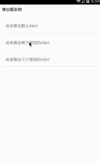
class AlertDemo extends Component {
render() {
return (
<View>
<Text style=>
弹出框实例
</Text>
<CustomButton text='点击弹出默认Alert'
onPress={()=>Alert.alert('温馨提醒','确定退出吗?')}
/>
<CustomButton text='点击弹出两个按钮的Alert'
onPress={()=>Alert.alert('温馨提醒','确定退出吗?',[
{text:'取消',onPress:()=>ToastAndroid.show('你点击了取消~',ToastAndroid.SHORT)},
{text:'确定',onPress:()=>ToastAndroid.show('你点击了确定~',ToastAndroid.SHORT)}
])}
/>
<CustomButton text='点击弹出三个按钮的Alert'
onPress={()=>Alert.alert('温馨提醒','确定退出吗?',[
{text:'One',onPress:()=>ToastAndroid.show('你点击了One~',ToastAndroid.SHORT)},
{text:'Two',onPress:()=>ToastAndroid.show('你点击了Two~',ToastAndroid.SHORT)},
{text:'Three',onPress:()=>ToastAndroid.show('你点击了Three~',ToastAndroid.SHORT)}
])}
/>
</View>
);
}
}
const styles = StyleSheet.create({
button: {
margin:5,
backgroundColor: 'white',
padding: 15,
borderBottomWidth: StyleSheet.hairlineWidth,
borderBottomColor: '#cdcdcd',
}
});
AppRegistry.registerComponent('AlertDemo', () => AlertDemo);
effect
NetInfo模块
官方实例代码
NetInfo.fetch().done((reach) => {
  console.log('Initial: ' + reach);
});
function handleFirstConnectivityChange(reach) {
  console.log('First change: ' + reach);
  NetInfo.removeEventListener(
    'change',
    handleFirstConnectivityChange
  );
}
NetInfo.addEventListener(
  'change',
  handleFirstConnectivityChange
);
在Android平台上面为了获取网络状态,我们需要在android项目的AndroidManifest.xml文件中配置以下的权限:
<uses-permission android:name="android.permission.ACCESS_NETWORK_STATE" />
isConnectionExpensive(判断连接的网络是否计费)
该方法只适合Android平台,用来判断当前连接的网络是否需要收费。例如当用户连接的是移动数据网络,那么会判断成该网络是需要计费的。具体判断代码如下:
NetInfo.isConnectionExpensive((isConnectionExpensive) => {

  console.log('Connection is ' + (isConnectionExpensive ? 'Expensive' : 'Not Expensive'));

});
isConnected
该方法是合适所有的平台,通过异步方法来获取当前与没有网络连接,具体检测代码实例如下:
NetInfo.isConnected.fetch().done((isConnected) => {

  console.log('First, is ' + (isConnected ? 'online' : 'offline'));

});

function handleFirstConnectivityChange(isConnected) {

  console.log('Then, is ' + (isConnected ? 'online' : 'offline'));

  NetInfo.isConnected.removeEventListener(

    'change',

    handleFirstConnectivityChange

  );

}

NetInfo.isConnected.addEventListener(

  'change',

  handleFirstConnectivityChange

);
NetInfo基本用法,进行检测当前设备的网络连接状态,网络详细信息已经是否计费,具体代码如下:
/**
 * Sample React Native App
 * https://github.com/facebook/react-native
 */
'use strict';
import React, {
  NetInfo,
  AppRegistry,
  Component,
  StyleSheet,
  Text,
  View,
  ToastAndroid,
} from 'react-native';

class NetInfoDemo extends Component {
  constructor(props){
        super(props);
        this.state = {
           isConnected: null,
           connectionInfo:null,
     };
    }
  componentDidMount() {
    NetInfo.isConnected.addEventListener(
        'change',
         this._handleConnectivityChange
    );
    //检测网络是否连接
    NetInfo.isConnected.fetch().done(
        (isConnected) => { this.setState({isConnected}); }
    );
    //检测网络连接信息
     NetInfo.fetch().done(
        (connectionInfo) => { this.setState({connectionInfo}); }
    );
  }
  componentWillUnmount() {
    NetInfo.isConnected.removeEventListener(
        'change',
        this._handleConnectivityChange
    );
  }
  _handleConnectivityChange(isConnected) {
       ToastAndroid.show((isConnected ? 'online' : 'offline'),ToastAndroid.SHORT);
  }
  render() {
    return (
      <View >
        <Text style={styles.welcome}>
            当前的网络状态
        </Text>
        <Text style={styles.welcome}>
           {this.state.isConnected ? '网络在线' : '离线'}
        </Text>
        <Text style={styles.welcome}>
            当前网络连接类型
        </Text>
        <Text style={styles.welcome}>
            {this.state.connectionInfo}
        </Text>
        <Text style={styles.welcome}>
            当前连接网络是否计费
        </Text>
        <Text style={styles.welcome}>
          {NetInfo.isConnectionExpensive === true ? '需要计费' : '不要'}
        </Text>
      </View>
    );
  }
}
const styles = StyleSheet.create({
  welcome: {
    fontSize: 16,
    textAlign: 'left',
    margin: 10,
  },
});
AppRegistry.registerComponent('NetInfoDemo', () => NetInfoDemo);
effect
AsyncStorage模块
AsyncStorage模块对于App客户端来讲是一个简单的,异步,持久化的键-值对存储系统,该模块的使用可以用来代替本地存储模块。从官方文档看出:官方建议我们最好针对AsyncStorage进行一下抽象的封装在进行使用,而且不是直接拿AsyncStorage进行使用。因为使用AsyncStorage是操作全局的。
当前模块是对原生实现提供了一个比较简单的封装。尽可能的提供一个比较清晰的JS API,返回正确的错误对象,简单并且单一的方法,每个方法都会返回一个Promise对象
[注].Promise对象:是用来传递异步操作的消息。它代表某个未来才会知道结果的事件(通常是一个异步操作),并且这个事件提供统一的API,可供进一步处理。
Promise对象有以下两个特点:
1.对象的状态不受外界影响。2.一旦状态改变就不会改变,任何时候都可以得到这个结果。
使用实例
/**
* Sample React Native App
* https://github.com/facebook/react-native
*/
'use strict';
import React, {
AppRegistry,
Component,
StyleSheet,
Text,
View,
AsyncStorage,
TouchableHighlight,
} from 'react-native';
var STORAGE_KEY_ONE = '@AsyncStorageDemo:key_one';
var STORAGE_KEY_MESSAGE = '@AsyncStorageDemo:key_message';
//简单封装一个组件
class CustomButton extends React.Component {
render() {
return (
<TouchableHighlight
style={styles.button}
underlayColor="#a5a5a5"
onPress={this.props.onPress}>
<Text style={styles.buttonText}>{this.props.text}</Text>
</TouchableHighlight>
);
}
}
class AsyncStorageDemo extends Component {
constructor(props){
super(props);
this.state={
messages:[],
};
}
//组件挂载之后回调方法
componentDidMount(){
this._loadInitialState().done();
}
//初始化数据-默认从AsyncStorage中获取数据
async _loadInitialState(){
try{
var value=await AsyncStorage.getItem(STORAGE_KEY_ONE);
if(value!=null){
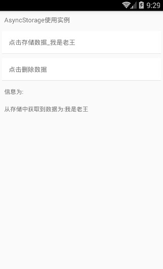
this._appendMessage('从存储中获取到数据为:'+value);
}else{
this._appendMessage('存储中无数据,初始化为空数据');
}
}catch(error){
this._appendMessage('AsyncStorage错误'+error.message);
}
}
//进行储存数据_ONE
async _saveValue_One(){
try{
await AsyncStorage.setItem(STORAGE_KEY_ONE,'我是老王');
this._appendMessage('保存到存储的数据为:'+'我是老王');
}catch(error){
this._appendMessage('AsyncStorage错误'+error.message);
}
}
//进行存储数据删除_ONE
async _removeValue_One(){
try{
await AsyncStorage.removeItem(STORAGE_KEY_ONE);
this._appendMessage('数据删除成功...');
}catch(error){
this._appendMessage('AsyncStorage错误'+error.message);
}
}
//进行把message信息添加到messages数组中
_appendMessage(message){
this.setState({messages:this.state.messages.concat(message)});
}
render() {
return (
<View>
<Text style={styles.welcome}>
AsyncStorage使用实例
</Text>
<CustomButton text='点击存储数据_我是老王' onPress={/*this._saveValue_One*/ ()=>{this._saveValue_One()} }/>
<CustomButton text='点击删除数据' onPress={()=>{this._removeValue_One()}}/>
<Text style={styles.content}>信息为:</Text>
{this.state.messages.map((m) => <Text style={styles.content} key={m}>{m}</Text>)}
</View>
);
}
}
const styles = StyleSheet.create({
welcome: {
fontSize: 14,
textAlign: 'left',
margin: 10,
},
content:{
fontSize: 13,
textAlign: 'left',
margin: 10,
},
button: {
margin:5,
backgroundColor: 'white',
padding: 15,
borderBottomWidth: StyleSheet.hairlineWidth,
borderBottomColor: '#cdcdcd',
}
});
AppRegistry.registerComponent('AsyncStorageDemo', () => AsyncStorageDemo);
effect
Dimensions模块
example
/**
 * Sample React Native App
 * https://github.com/facebook/react-native
 */
'use strict';
import React, {
  AppRegistry,
  Component,
  StyleSheet,
  Text,
  View,
  Dimensions,
} from 'react-native';

class DimensionsDemo extends Component {
  render() {
    return (
      <View style={styles.container}>
        <Text style={styles.welcome}>
          屏幕信息如下:
        </Text>
        <Text style={styles.instructions}>
           当前屏幕宽度:+{Dimensions.get('window').width};
        </Text>
        <Text style={styles.instructions}>
           当前屏幕高度:'+{Dimensions.get('window').height};
        </Text>
      </View>
    );
  }
}
const styles = StyleSheet.create({
  container: {
    flex: 1,
    justifyContent: 'center',
    alignItems: 'center',
    backgroundColor: '#F5FCFF',
  },
  instructions: {
    textAlign: 'center',
    color: '#333333',
    marginBottom: 5,
  },
});

AppRegistry.registerComponent('DimensionsDemo', () => DimensionsDemo);
effect

BackAndroid模块
BackAndroid模块用来进行拦截硬件设备的Back返回键事件。如果没有设置任何监听函数或者监听函数返回false,那么会调用默认的返回键功能进行退出应用
BackAndroid.addEventListener('hardwareBackPress', function() {
     if (!this.onMainScreen()) {
       this.goBack();
       return true;
     }
     return false;
});
example
/**
 * Sample React Native App
 * https://github.com/facebook/react-native
 */
'use strict';
import React, {
  AppRegistry,
  Component,
  StyleSheet,
  Text,
  View,
  BackAndroid,
  ToastAndroid,
} from 'react-native';
var count=2;
class BackAndroidDemo extends Component {
  //组件挂载的时候调用
  componentDidMount(){
      BackAndroid.addEventListener('hardwareBackPress',function(){
          if(count>=1){
            ToastAndroid.show('收到点击返回键信息...'+count,ToastAndroid.SHORT);
            count--;
            return true;
          }else{
            return false;
          }
      });
  }
  render() {
    return (
      <View style={styles.container}>
        <Text style={styles.welcome}>
           BackAndroid模块使用实例
        </Text>
        <Text style={styles.instructions}>
             请点击返回键查看效果...
        </Text>
      </View>
    );
  }
}

const styles = StyleSheet.create({
  container: {
    flex: 1,
    justifyContent: 'center',
    alignItems: 'center',
    backgroundColor: '#F5FCFF',
  },
  welcome: {
    fontSize: 20,
    textAlign: 'center',
    margin: 10,
  },
  instructions: {
    textAlign: 'center',
    color: '#333333',
    marginBottom: 5,
  },
});

AppRegistry.registerComponent('BackAndroidDemo', () => BackAndroidDemo);
effect