泰坦尼克号的沉没是历史上最出名的沉船事件。1912年4月15号,在它第一次出航的时候因撞击冰川而沉没,2224名乘客与乘务人员中,1502人不幸身亡。这场惨剧震惊了国际社会,随后世界各地都大力加强了船只的安全监管。导致大量伤亡的原因之一是缺乏足够的救生艇。一些因素决定了某些人幸存下来的几率比其他人更大,比如女性,小孩以及上层阶级。在这次竞赛中,我们要求你分析哪一类人更有可能幸存下来,然后使用机器学习的工具预测某位乘客能否在灾难中幸存下来。
以上出自 Kaggle 泰坦尼克号幸存者项目 项目介绍
数据处理
用 pandas 读取数据:
df = pd.read_csv("train.csv")
df
小心处理那些缺失数据
Ticket 与 Cabin 缺失了很多信息,所以不适合作为分析的材料,让我们把这两列从 DataFrame 中去除:
df = df.drop(['Ticket','Cabin'], axis=1)
然后把有数据缺失的行去掉:

df = df.dropna()
现在我们有了一个干净清晰的数据集,可以进行分析了!
先感受一下数据可视化的威力
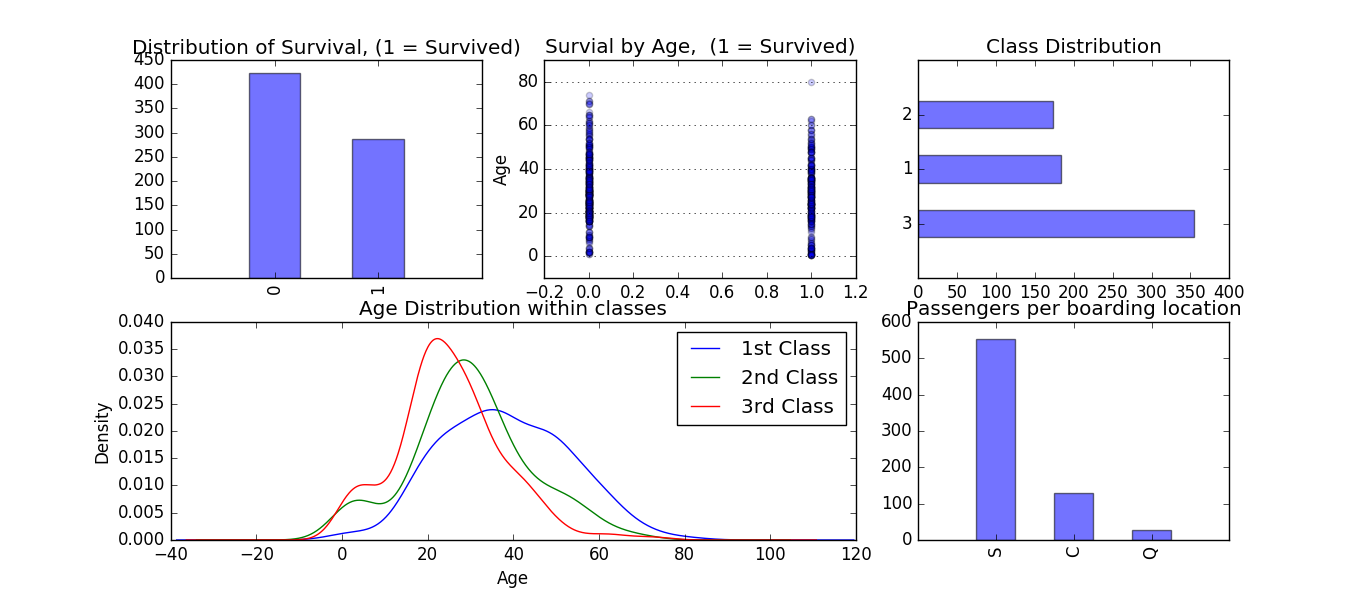
import pandas as pd
import matplotlib.pyplot as plt
from pylab import *

df = pd.read_csv("train.csv")

df = df.drop(['Ticket','Cabin'], axis=1)

df = df.dropna()


# 指定图的参数
fig = plt.figure(figsize=(18,6), dpi=100)
alpha=alpha_scatterplot = 0.2
alpha_bar_chart = 0.55

# 幸存数量对比
ax1 = plt.subplot2grid((2,3),(0,0))
# plots a bar graph of those who surived vs those who did not.
df.Survived.value_counts().plot(kind='bar', alpha=alpha_bar_chart)
# this nicely sets the margins in matplotlib to deal with a recent bug 1.3.1
ax1.set_xlim(-1, 2)
# puts a title on our graph
plt.title("Distribution of Survival, (1 = Survived)")

# 年龄与幸存数量的关系对比
plt.subplot2grid((2,3),(0,1))
plt.scatter(df.Survived, df.Age, alpha=alpha_scatterplot)
# sets the y axis lable
plt.ylabel("Age")
# formats the grid line style of our graphs
plt.grid(b=True, which='major', axis='y')
plt.title("Survial by Age,  (1 = Survived)")

# 阶级与幸存数量的关系对比
ax3 = plt.subplot2grid((2,3),(0,2))
df.Pclass.value_counts().plot(kind="barh", alpha=alpha_bar_chart)
ax3.set_ylim(-1, len(df.Pclass.value_counts()))
plt.title("Class Distribution")

# 年龄与阶级
plt.subplot2grid((2,3),(1,0), colspan=2)
# plots a kernel desnsity estimate of the subset of the 1st class passanges's age
df.Age[df.Pclass == 1].plot(kind='kde')
df.Age[df.Pclass == 2].plot(kind='kde')
df.Age[df.Pclass == 3].plot(kind='kde')
 # plots an axis lable
plt.xlabel("Age")
plt.title("Age Distribution within classes")
# sets our legend for our graph.
plt.legend(('1st Class', '2nd Class','3rd Class'),loc='best')

#登机位置与幸存数量的关系对比
ax5 = plt.subplot2grid((2,3),(1,2))
df.Embarked.value_counts().plot(kind='bar', alpha=alpha_bar_chart)
ax5.set_xlim(-1, len(df.Embarked.value_counts()))
# specifies the parameters of our graphs
plt.title("Passengers per boarding location")


plt.show()
数据可视化的探索尝试
竞赛的关键是要预测基于某人员的某些特征信息,该人员是否能在泰坦尼克号事件中存活,特征可能包括:
- 乘客阶级(pclass)
- 性别(Sex)
- 年龄(Age)
- 船票价格(Fare Price)
看看我们能不能通过数据可视化来获得更好的理解。
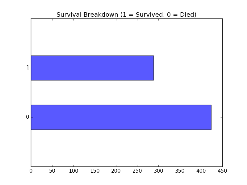
首先用条形图表现幸存与死亡的数量对比:
plt.figure(figsize=(6,4))
fig, ax = plt.subplots()
df.Survived.value_counts().plot(kind='barh', color="blue", alpha=.65)
ax.set_ylim(-1, len(df.Survived.value_counts()))
plt.title("Survival Breakdown (1 = Survived, 0 = Died)")
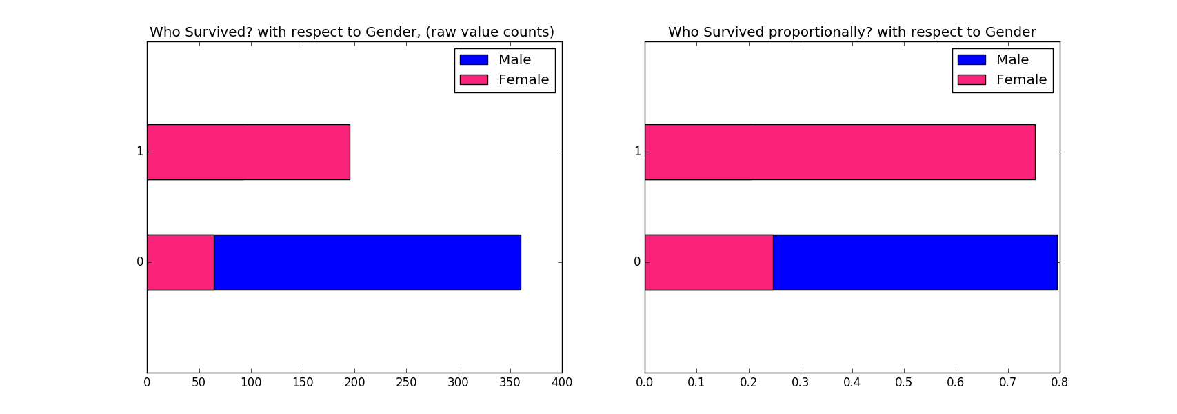
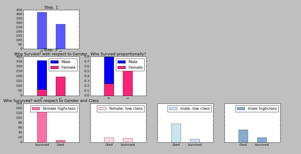
从数据中挖掘出更多结构来:比如性别
fig = plt.figure(figsize=(18,6))

# 各个性别幸存数量的关系对比
ax1 = fig.add_subplot(121)
df.Survived[df.Sex == 'male'].value_counts(sort=False).plot(kind='barh',label='Male')
df.Survived[df.Sex == 'female'].value_counts(sort=False).plot(kind='barh', color='#FA2379',label='Female')
ax1.set_ylim(-1, 2)
plt.title("Who Survived? with respect to Gender, (raw value counts) "); plt.legend(loc='best')

# 各个性别幸存率百分比关系
# adjust graph to display the proportions of survival by gender
ax2 = fig.add_subplot(122)
(df.Survived[df.Sex == 'male'].value_counts(sort=False)/float(df.Sex[df.Sex == 'male'].size)).plot(kind='barh',label='Male')
(df.Survived[df.Sex == 'female'].value_counts(sort=False)/float(df.Sex[df.Sex == 'female'].size)).plot(kind='barh', color='#FA2379',label='Female')
ax2.set_ylim(-1, 2)
plt.title("Who Survived proportionally? with respect to Gender"); plt.legend(loc='best')
干得漂亮,让我们再深入一些
可以从Pclass入手,挖掘出更多内容来,将 class 1-2 归类为高阶级,class 3 归类为低阶级:
fig = plt.figure(figsize=(18,4), dpi=1600)
alpha_level = 0.65

# building on the previous code, here we create an additional subset with in the gender subset
# we created for the survived variable. I know, thats a lot of subsets. After we do that we call
# value_counts() so it it can be easily plotted as a bar graph. this is repeated for each gender
# class pair.

# 女性高阶级
ax1=fig.add_subplot(141)
female_highclass = df.Survived[df.Sex == 'female'][df.Pclass != 3].value_counts()
female_highclass.plot(kind='bar', label='female highclass', color='#FA2479', alpha=alpha_level)
ax1.set_xticklabels(["Survived", "Died"], rotation=0)
ax1.set_xlim(-1, len(female_highclass))
plt.title("Who Survived? with respect to Gender and Class"); plt.legend(loc='best')

# 女性低阶级
ax2=fig.add_subplot(142, sharey=ax1)
female_lowclass = df.Survived[df.Sex == 'female'][df.Pclass == 3].value_counts()
female_lowclass.plot(kind='bar', label='female, low class', color='pink', alpha=alpha_level)
ax2.set_xticklabels(["Died","Survived"], rotation=0)
ax2.set_xlim(-1, len(female_lowclass))
plt.legend(loc='best')

# 男性高阶级
ax3=fig.add_subplot(143, sharey=ax1)
male_lowclass = df.Survived[df.Sex == 'male'][df.Pclass == 3].value_counts()
male_lowclass.plot(kind='bar', label='male, low class',color='lightblue', alpha=alpha_level)
ax3.set_xticklabels(["Died","Survived"], rotation=0)
ax3.set_xlim(-1, len(male_lowclass))
plt.legend(loc='best')

#男性低阶级
ax4=fig.add_subplot(144, sharey=ax1)
male_highclass = df.Survived[df.Sex == 'male'][df.Pclass != 3].value_counts()
male_highclass.plot(kind='bar', label='male highclass', alpha=alpha_level, color='steelblue')
ax4.set_xticklabels(["Died","Survived"], rotation=0)
ax4.set_xlim(-1, len(male_highclass))
plt.legend(loc='best')
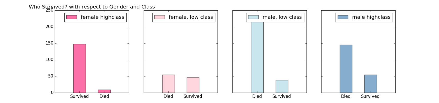
漂亮!现在我们有了更多的关于谁会幸存谁会死亡的信息。对数据有了更深刻的理解,就是时候开始建立模型了。这是交互式数据分析的典型程序,先了解数据中的基础关系再一点一点增加复杂度,通过在工作中得到的新的发现,进一步完善模型。下面对之前的可视化工作做了一个汇总。
开始建立模型预测结果吧!
监督学习
在统计学中,logistic 回归或 logit 回归是回归分析的一种类型,目的在于根据一个或多个预测变量预测分类因变量(分类因变量指的是拥有有限个值的因变量,它的大小没有意义,但值的排列顺序可能有意义)。使用 logistic 方程以预测量为输入对输出的因变量的概率进行建模。通常情况下,logistic 用到逻辑回归的问题的因变量都是二分类的,正适合我们的题目。
竞赛要求我们预测一个二分类结果。它希望我们的模型能够告诉它某个人在这场灾难中是生(1)是死(0)。我们最好先从已有数据中的人的幸存率开始算起,可能会得到以下结果:

(Y轴代表个人的幸存率,X轴代表第1到第891位乘客)
显然,这张图并没有告诉我们某位乘客是生是死,它只告诉了我们乘客生死的概率。我们需要自己把生死的概率翻译成生或死的结果。但要怎么做呢?我们可以说幸存率 > 50% 的人会幸存下来。

后面还有一些数据挖掘的知识点,创建logistic 回归模型,暂时无法解决,最后使用模型预测测试数据集的结果,将结果保存下来提交到 Kaggle 上查看数据的正确率。
参考链接:
Titanic: Machine Learning from Disaster