This papper mainly includes the following contents
- Action Sheets
- Alerts
- Badges
- Buttons
- Cards
Action Sheets
Action Sheets slide up from the bottom edge of the device screen, and display a set of options with the ability to confirm or cancel an action. Action Sheets can sometimes be used as an alternative to menus, however, they should not be used for navigation.
The Action Sheet always appears above any other components on the page, and must be dismissed in order to interact with the underlying content. When it is triggered, the rest of the page darkens to give more focus to the Action Sheet options.
Basic Usage
import {Component} from '@angular/core';
import {Platform, ActionSheet, NavController} from 'ionic-angular';
@Component({
templateUrl: 'build/pages/test/test.html'
})
export class Test {
constructor(public platform: Platform, public nav: NavController) { }
openMenu() {
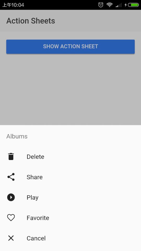
let actionSheet = ActionSheet.create({
title: 'Albums',
cssClass: 'action-sheets-basic-page',
buttons: [
{
text: 'Delete',
role: 'destructive',
icon: !this.platform.is('ios') ? 'trash' : null,
handler: () => {
console.log('Delete clicked');
}
},
{
text: 'Share',
icon: !this.platform.is('ios') ? 'share' : null,
handler: () => {
console.log('Share clicked');
}
},
{
text: 'Play',
icon: !this.platform.is('ios') ? 'arrow-dropright-circle' : null,
handler: () => {
console.log('Play clicked');
}
},
{
text: 'Favorite',
icon: !this.platform.is('ios') ? 'heart-outline' : null,
handler: () => {
console.log('Favorite clicked');
}
},
{
text: 'Cancel',
role: 'cancel', // will always sort to be on the bottom
icon: !this.platform.is('ios') ? 'close' : null,
handler: () => {
console.log('Cancel clicked');
}
}
]
});
this.nav.present(actionSheet);
}
}
Effect
Alerts
Alerts are a great way to offer the user the ability to choose a specific action or list of actions. They also can provide the user with important information, or require them to make a decision (or multiple decisions).
From a UI perspective, you can think of Alerts as a type of “floating” modal, that covers only a portion of the screen. This means Alerts should only be used for quick actions like password verification, small app notifications, or quick options. More in depth user flows should be reserved for full screen Modals.
Alerts are quite flexible, and can easily be customized. Check out the API docs for more information.
different kindes of alerts
- Basic Alerts
- Prompt Alerts
- Confirmation Alerts
- Radio Alerts
- Checkbox Alerts
Confirmation Alerts
Confirmation Alerts are used when it is required that the user explicitly confirms a particular choice before progressing forward in the app. A common example of the Confirmation Alert is checking to make sure a user wants to delete or remove a contact from their address book.
import {Component} from '@angular/core';
import {Alert, NavController} from 'ionic-angular';


@Component({
    templateUrl: 'build/pages/test/test.html'
})
export class Test {

  constructor(public nav: NavController) { }

  doConfirm() {
    let confirm = Alert.create({
      title: 'Use this lightsaber?',
      message: 'Do you agree to use this lightsaber to do good across the intergalactic galaxy?',
      buttons: [
        {
          text: 'Disagree',
          handler: () => {
            console.log('Disagree clicked');
          }
        },
        {
          text: 'Agree',
          handler: () => {
            console.log('Agree clicked');
          }
        }
      ]
    });
    this.nav.present(confirm);
  }

}
effects


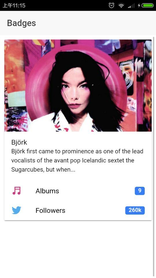
Badges
Badges are small components that typically communicate a numerical value to the user. They are typically used within an item.
example
<ion-header>
  <ion-navbar>
    <ion-title>Badges</ion-title>
  </ion-navbar>
</ion-header>

<ion-content>

  <ion-card>

    <img src="./img/bjork-live.jpg"/>

    <ion-card-content>
      <h2 class="card-title">
        Björk
      </h2>
      <p>
        Björk first came to prominence as one of the lead vocalists of the avant pop Icelandic sextet the Sugarcubes, but when...
      </p>
    </ion-card-content>

    <ion-item>
      <ion-icon name='musical-notes' item-left style="color: #d03e84"></ion-icon>
      Albums
      <ion-badge item-right>9</ion-badge>
    </ion-item>

    <ion-item>
      <ion-icon name='logo-twitter' item-left style="color: #55acee"></ion-icon>
      Followers
      <ion-badge item-right>260k</ion-badge>
    </ion-item>

  </ion-card>

</ion-content>
Buttons
Buttons are an essential way to interact with and navigate through an app, and should clearly communicate what action will occur after the user taps them. Buttons are simple components in Ionic, can consist of text, an icon, or both, and can be enhanced with a wide range of attributes.
variable kinds of buttons
- Contents
- Default Style
- Outline Style
- Clear Style
- Round Buttons
- Block Buttons
- Full Buttons
- Button Sizes
- Icon Buttons
- Floating Action Buttons
- Buttons In Components
example
Basic Usage
<button>Button</button>
The primary property sets the color of the button. Ionic includes a number of default colors which can be easily overridden:
<button light>Light</button>
<button>Primary</button>
<button secondary>Secondary</button>
<button danger>Danger</button>
<button dark>Dark</button>
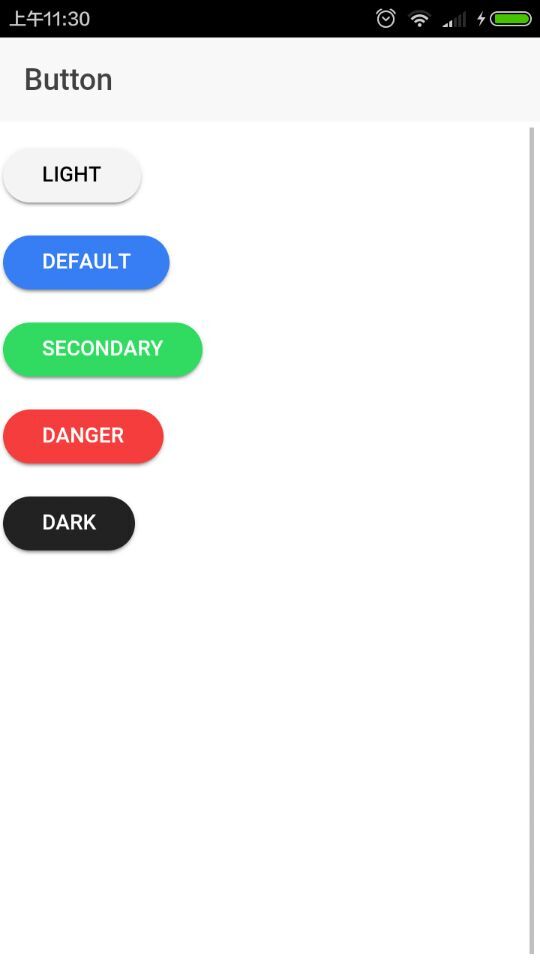
Round Buttons
<ion-header>
  <ion-navbar>
    <ion-title>Button</ion-title>
  </ion-navbar>
</ion-header>

<ion-content>

  <p>
    <button light round>Light</button>
  </p>
  <p>
    <button round>Default</button>
  </p>

  <p>
    <button secondary round>Secondary</button>
  </p>

  <p>
    <button danger round>Danger</button>
  </p>

  <p>
    <button dark round>Dark</button>
  </p>
</ion-content>
Cards
Cards are a great way to display important pieces of content, and are quickly emerging as a core design pattern for apps. They’re are a great way to contain and organize information, while also setting up predictable expectations for the user. With so much content to display at once, and often so little screen realestate, cards have fast become the design pattern of choice for many companies, including the likes of Google, Twitter, and Spotify.
For mobile experiences, Cards make it easy to display the same information visually across many different screen sizes. They allow for more control, are flexible, and can even be animated. Cards are usually placed on top of one another, but they can also be used like a “page” and swiped between, left and right.
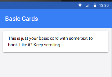
Basic Usage
Cards are primarily a CSS component. To use add a basic card, follow this structure:
<ion-card>

  <ion-card-header>
    Card Header
  </ion-card-header>

  <ion-card-content>
    <!-- Add card content here! -->
  </ion-card-content>

</ion-card>
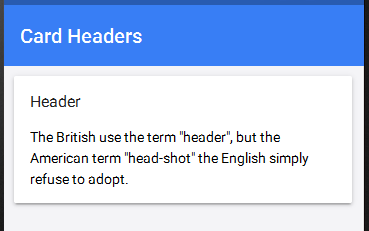
Card Headers
Just like a normal page, cards can be customized to include headers. To add use add a card header, add the
<ion-card>
  <ion-card-header>
    Header
  </ion-card-header>
  <ion-card-content>
    The British use the term "header", but the American term "head-shot" the English simply refuse to adopt.
  </ion-card-content>
</ion-card>
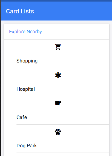
Lists In Cards
A card can contain a list of items. To create a card list, add elements with the ion-item attribute inside of an ion-list in your card:
<ion-card>
  <ion-card-header>
    Explore Nearby
  </ion-card-header>

  <ion-list>
    <button ion-item>
      <ion-icon name="cart" item-left></ion-icon>
      Shopping
    </button>

    <button ion-item>
      <ion-icon name="medical" item-left></ion-icon>
      Hospital
    </button>

    <button ion-item>
      <ion-icon name="cafe" item-left></ion-icon>
      Cafe
    </button>

    <button ion-item>
      <ion-icon name="paw" item-left></ion-icon>
      Dog Park
    </button>

    <button ion-item>
      <ion-icon name="beer" item-left></ion-icon>
      Pub
    </button>

    <button ion-item>
      <ion-icon name="planet" item-left></ion-icon>
      Space
    </button>

  </ion-list>
</ion-card>
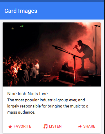
Images In Cards
Images often vary in size, so it is important that they adopt a consistent style throughout your app. Images can easily be added to cards. Adding an image to a card will give the image a constant width, and a variable height. Lists, headers, and other card components can easily be combined with image cards. To add an image to a card, use the following markup:
<ion-card>
  <img src="img/nin-live.png"/>
  <ion-card-content>
    <ion-card-title>
      Nine Inch Nails Live
      </ion-card-title>
    <p>
      The most popular industrial group ever, and largely
      responsible for bringing the music to a mass audience.
    </p>
  </ion-card-content>
</ion-card>
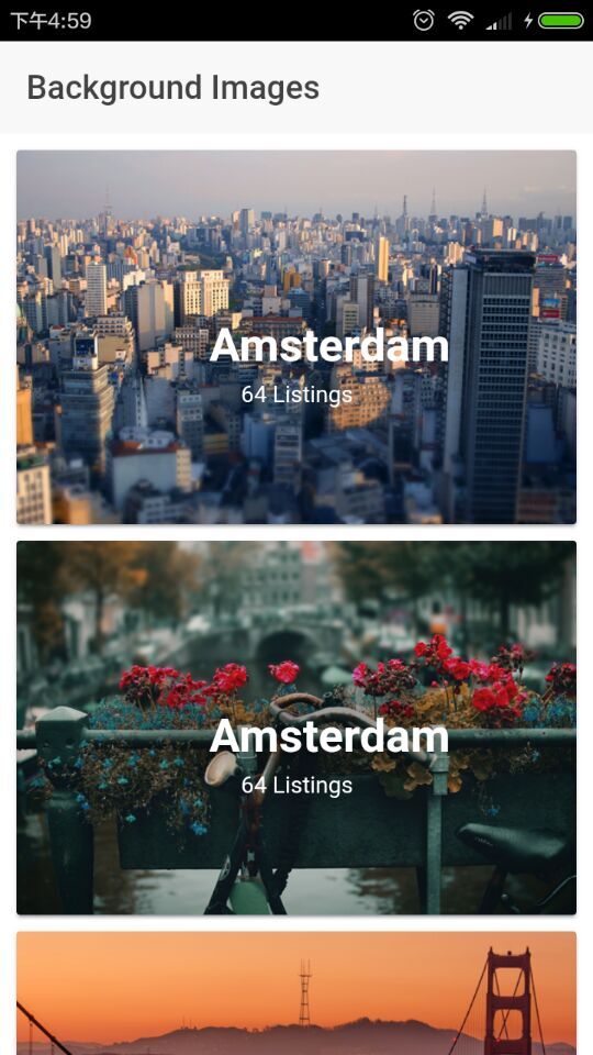
Background Images
Cards can be used to achieve a multitude of designs. We provide many of the elements to achieve common designs, but sometimes it will be necessary to add custom styles. Adding background images to cards is a perfect example of how adding custom styles can achieve a completely different look.
The following html can be added to the content of a page:
<ion-content class="card-background-page">

  <ion-card>
    <img src="img/card-saopaolo.png"/>
    <div class="card-title">São Paulo</div>
    <div class="card-subtitle">41 Listings</div>
  </ion-card>

  <ion-card>
    <img src="img/card-amsterdam.png"/>
    <div class="card-title">Amsterdam</div>
    <div class="card-subtitle">64 Listings</div>
  </ion-card>

  <ion-card>
    <img src="img/card-sf.png"/>
    <div class="card-title">San Francisco</div>
    <div class="card-subtitle">72 Listings</div>
  </ion-card>

  <ion-card>
    <img src="img/card-madison.png"/>
    <div class="card-title">Madison</div>
    <div class="card-subtitle">28 Listings</div>
  </ion-card>

</ion-content>
BE Careful
scss file must be import in app.core.scss file so it will work,or it will be invalid.